Wolfgang Tillmans’ current exhibition is on at Tate Modern in London U.K. until 11 June 2017. There are 14 themed rooms filled with work from the period 2003 to the present, so not a true retrospective and Tillmans isn’t presenting it as such.

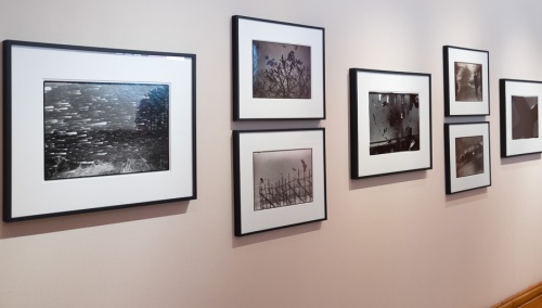
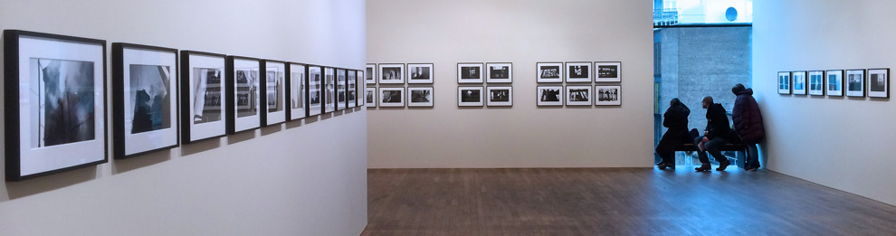
Tillmans uses the height available in the Tate Modern’s exhibition space. photo ©Malcolm Raggett
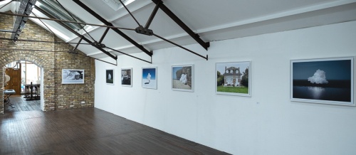
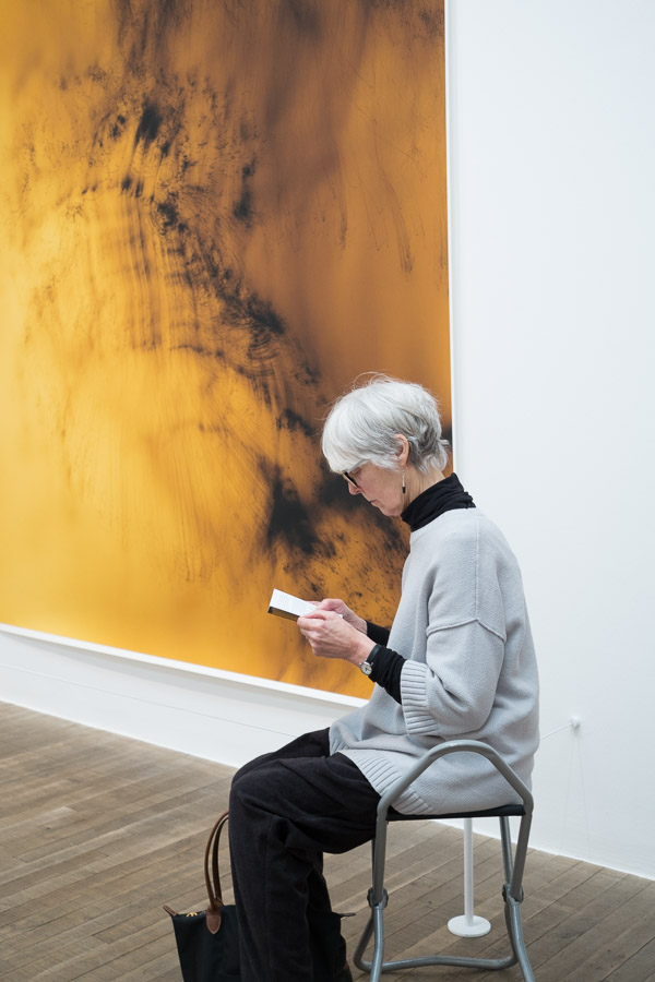
He’s saying ‘here’s what I’ve been fascinated by over the last 13 years and what’s inspired me to make my work.’ This period coincides with the widespread rise in digital technology both in photographic reproduction and in life in general. This has acted as inspiration and catalyst for a lot of the work in this exhibition. For example, there are two mural-size high resolution images of the ‘chaotic analogue static’ pattern displayed on a digital TV when it is not tuned. These invite close examination and ask when is a picture not a picture? In fact ‘where are the limits?’ is a frequent refrain in Tillmans’ work.
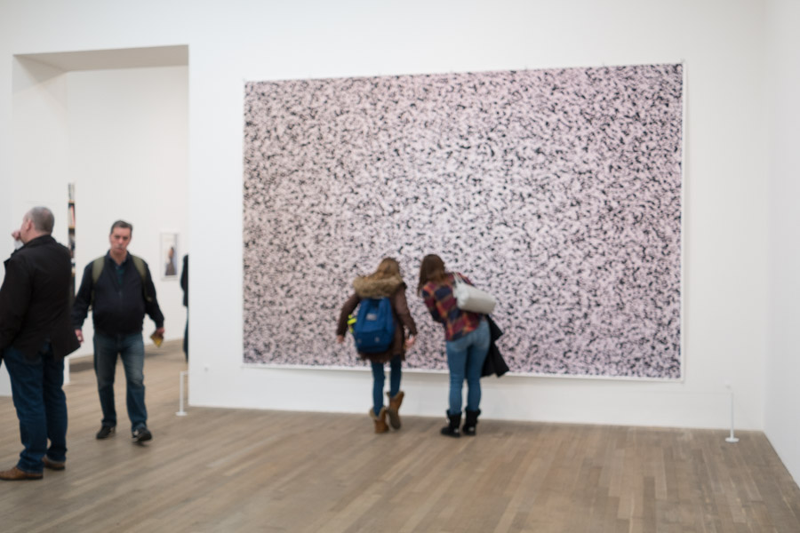
Mural sized images invite close examination. photo © Malcolm Raggett
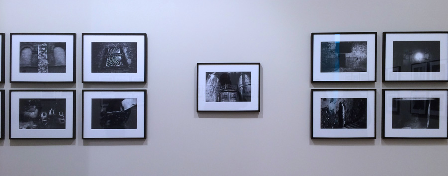
Tillmans has had a long-held belief in the purity of the unframed image (his words) [1] and many of the images in the show are clipped to or taped to the walls. There are some framed images though, and it is interesting the effect this has, especially when the two types are mixed: the unframed images seem to be more about the subject and idea and feel like a raw work-in-progress whereas the framed prints have the air of stand-alone finished art objects. Initially this juxtaposing of framed and unframed is unfamiliar and disquieting but is part of Tillmans questioning of how meaning and charge can be incorporated into an industrially produced image, a question that flows through the whole exhibition and extends from the theorist Walter Benjamin’s concept of aura [2].
There is an old aphorism that goes ‘never let the facts stand in the way of a good story’ that applies in varying proportion to many parts of the media, but in 2004 it was show beyond reasonable doubt that the widely-held belief that Iraq had weapons of mass destruction, which was the main justification for invasion by western powers, was incorrect. For those who had any lingering doubt it demonstrated that governments, too, could not be relied on to produce accurate information and that any criticism of the media by government was a case of the pot calling the kettle black. There were also numerous lower profile cases of misinformation by vested interests around the globe and it was probably Tillmans increasing awareness of this that prompted him to set up his Truth Study Center [sic]. He originally declared that the Truth Study Center was set up to examine ‘our desire to find a universal truth and the impossibility of doing so.'[3]. In late 2005 he released a book of the same title and included work in an exhibition at The Serpentine Gallery, London, made up of
groups of photographs, cuttings from newspapers and magazines, pamphlets, advertisements, all kinds of printed matter, which he presented not on the wall but under glass on narrow custom-made wooden tables. Under the collective title Truth Study Center, they drew attention to the exercise of power behind the ideologies of Islamic fundamentalism, Catholicism, capitalism. He has subsequently included a version in various installations, adapting the subjects depending on the venue. [4]
So even in the early days of the Truth Study Center there was an intent to reveal specific alternatives to any official truths or myths, and he departed from a purely photographic medium to do so. The continuing need for such work is only emphasised by, for example, the current battle between the US presidency and the media over ‘facts’. There is certainly plenty of material for Tillmans and he uses it to strong effect in room 4 of his current show; it is the largest and most densely-packed of the rooms. The presentation is the same as at the Serpentine with cuttings, photos and printed matter in glass-topped tables laid out in a way that invites the viewer to browse. It would be easy to spend an hour in this room alone if you are happy to read text as well as pictures. It is informative, fascinating and worrying. Tillmans reveals, if we didn’t know already, that the only ‘universal truth’ is that there is no such thing!
Abstract images have long had a fascination for Tillmans. He started experimenting with abstraction while at school [5] and sees it as a process of taking photography to its maximum potential [1] unfettered by the requirement to be representational, an assumption that viewers frequently make when looking at a photographically produced image. Many of Tillmans’ abstracts are not even made with a camera and yet such is the human desire for metaphor that most people will try to find a representation of this world in pure abstract photographs. It reminds me of this or that is a frequent reaction to abstraction, which shows that the viewer is engaging their imagination when faced with the image and not just passively accepting the image as-is. Only one room is devoted to abstract images, though they occur throughout the exhibition, suggesting that Tillmans has reduced his interest in this area of work. But then something has to give way to the variety of other work, and too much abstraction is exhausting for the viewer, so although I enjoy Tillmans’ abstracts, I think he has the balance about right in this show.
The exhibition notes are a brief but well-written introduction to each room. Photo © Malcolm Raggett
With fourteen rooms and at least this many themes, there is so much complexity in the show that a lot more could be said. I’m going to finish up, though, with my last thought about Tillmans’ fascination with materiality and particularly paper. As an artist using photography it is not surprising that he’s interested in the material world: cameras are an exquisite tool for examining this. Less obvious to me is his claimed interest in the material qualities of paper [5]; paper is used extensively throughout the exhibition – it is the main base for all the works, but with a few exceptions it is not the materiality of paper that features here, at least not to my perception. As someone who is also fascinated by paper I would love to see a Tillmans show devoted to this topic. Maybe next time?
2017 is an engaging exhibition by an eclectic artist that is well worth visiting. There are lots of ways to read it at different levels; It is certainly worth going beyond the themes of the rooms and thinking about other unwritten strands that span the rooms. I’m looking forward to Wolfgang Tillmans’ next show already!
- Tillmans, W. 2010. From the Archive: In Conversation-Wolfgang Tillmans. https://photoworks.org.uk/conversation-wolfgang-tillmans/. Accessed 2017-02-16.
- Benjamin, W. 1936. The Work of Art in the Age of Mechanical Reproduction (translated). https://www.marxists.org/reference/subject/philosophy/works/ge/benjamin.htm. Accessed 2017-02-18.
- Anon. Taschen marketing material https://www.taschen.com/pages/en/catalogue/photography/all/01363/facts.wolfgang_tillmans_truth_study_center.htm. Accessed 2017-0219.
- Jobey, L. 2010. Wolfgang Tillmans: the Lightness of Being. in The Guardian. https://www.theguardian.com/artanddesign/2010/jun/26/wolfgang-tillmans-serpentine-photographs-exhibition. Accessed 2017-02-19.
- Anon. 2017. Wolfgang Tillmans 2017 Exhibition Notes. Tate Modern.