Deutsche Borse Photography Foundation Prize 2022

The Photographers’ Gallery, London UK, is currently exhibiting work by the four short-listed nominees for this year’s Deutsche Borse Photography Foundation prize (until 12 June 2022). Each has a different approach and each would be a worthy winner. It is easy to pick a personal favorite but much harder to say which photographer is the most worthy based on the exhibited work. Their back story and full body of work will need to be taken into account before a winner emerges.


Anastasia Samoylova ‘Floodzone’

Anastasia’s work is a climate change inspired on-going project examining the dissonance between continued habitation of coastal settlements and the rise in sea level. Her project started in Miami, Florida but is spreading to other communities. Many of her images seem at first glance banal, inconsequential, but you don’t have to look at them for long before their meaning deepens or the image becomes quizzical or disconcerting, which leads in turn to alternative readings.

One approach she uses is the combining of real 3D objects with 2D hoardings:

Untitled. Anastasia Samoylova

Anastasia’s approaches are messages to the reader to look with a more questioning attitude at what you see. Ask, for example, what will these scenes look like in 10 or 50 years time?

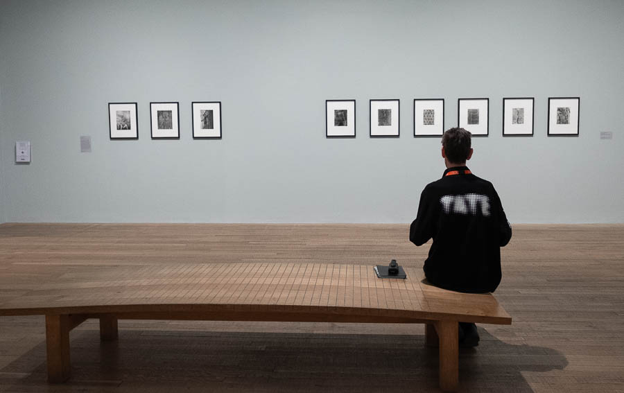
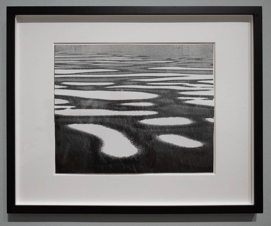
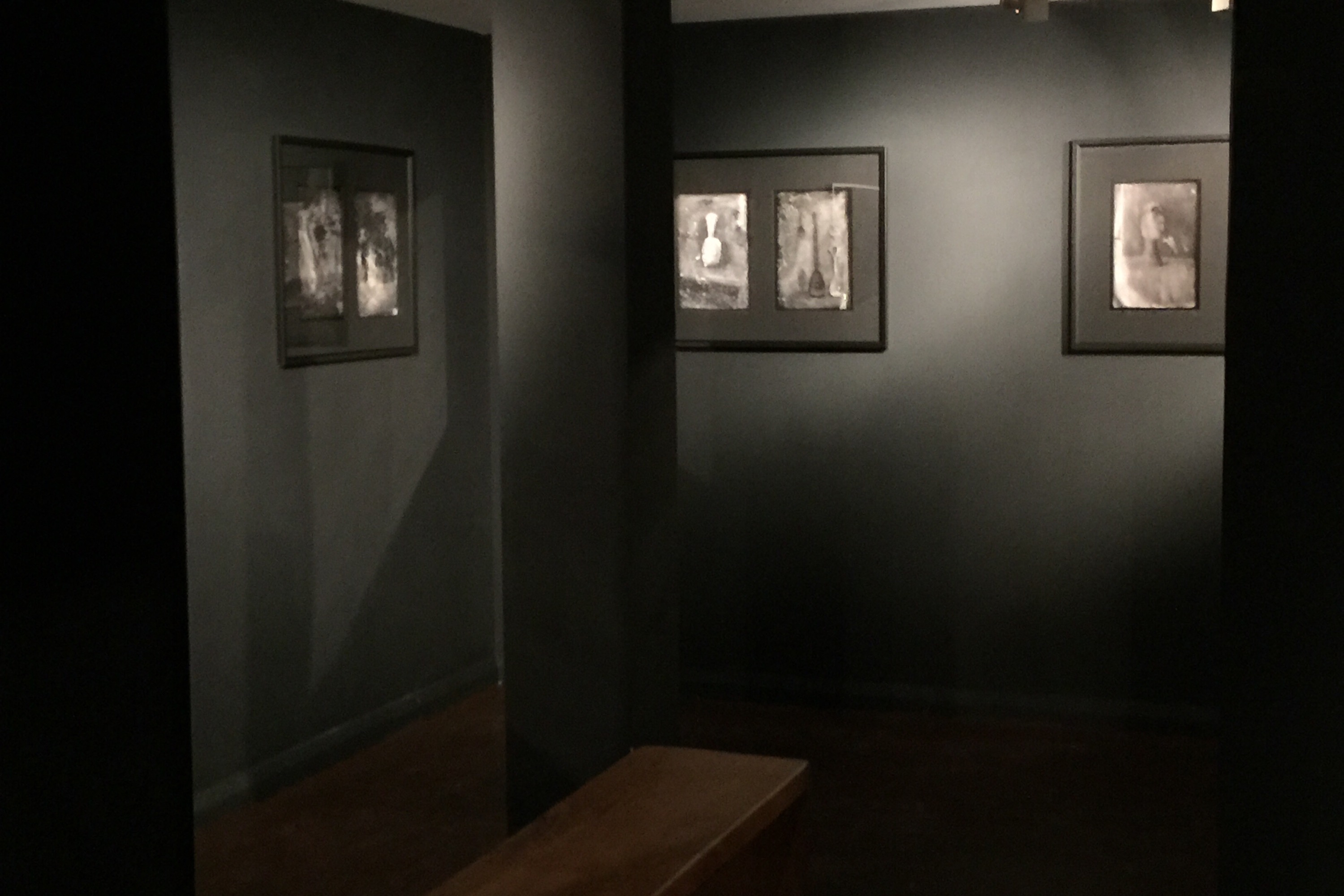
Jo Ratcliffe ‘Photographs 1980s – Now’

Jo’s photos have been made over a 30 year period and display a remarkable consistency of approach. They depict places of conflict and dispossession in South Africa and Angola though they are not of the conflict itself but the aftermath. They are still, haunting, monochrome images, each speaking of desertion and time suspended as if the clock dare not tick another second.

For the most part the images can be read individually or with a neighbouring image but there is a double-sided concertina book of images taken every 100km along the road from Johannesburg to Cape Town and back. I’m not a fan of this type of mechanistic photography and this book felt cold and uninviting. The rest of the images had a melancholy about them as if a wound had healed but the scar remains. The exhibition is an essay in the need to forgive but not to forget.

Taken at 100 kilometre intervals along route N1, South Africa. 1996-99. Jo Ratcliffe
Donkey. Jo Ratcliffe. Seen in this orientation you might think that the donkey is standing with its face to a wall, but when rotated 90° it takes on a different meaning:

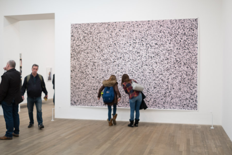
Deana Lawson ‘Centropy’

Deana’s photography plays with dichotomies: what is real versus what is unreal, what is shown versus what it means. Her photos can be read individually but when combined, themes of race and nuclear & extended family occur.

The images have mirror frames. This could allude to an Alice Throught the Looking Glass surreality. It also gives the viewer a glimpse of themselves, which creates an interesting engagement. An unintended consequence is reflections on the gallery floor giving an unexpected three dimensionality to the space.

An Ode to Yamaya. 2019. Deana Lawson

‘Niagara Falls 2018’ is intriguing – it has water apparently flowing in multiple directions and when the image is rotated it takes on a different sense and aquires a new meaning:

Niagara Falls. 2018. Deana Lawson. As exhibited
Niagara Falls. 2018 rotated 90° anticlockwise
Niagara Falls. 2018 rotated 180°

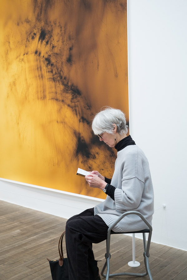
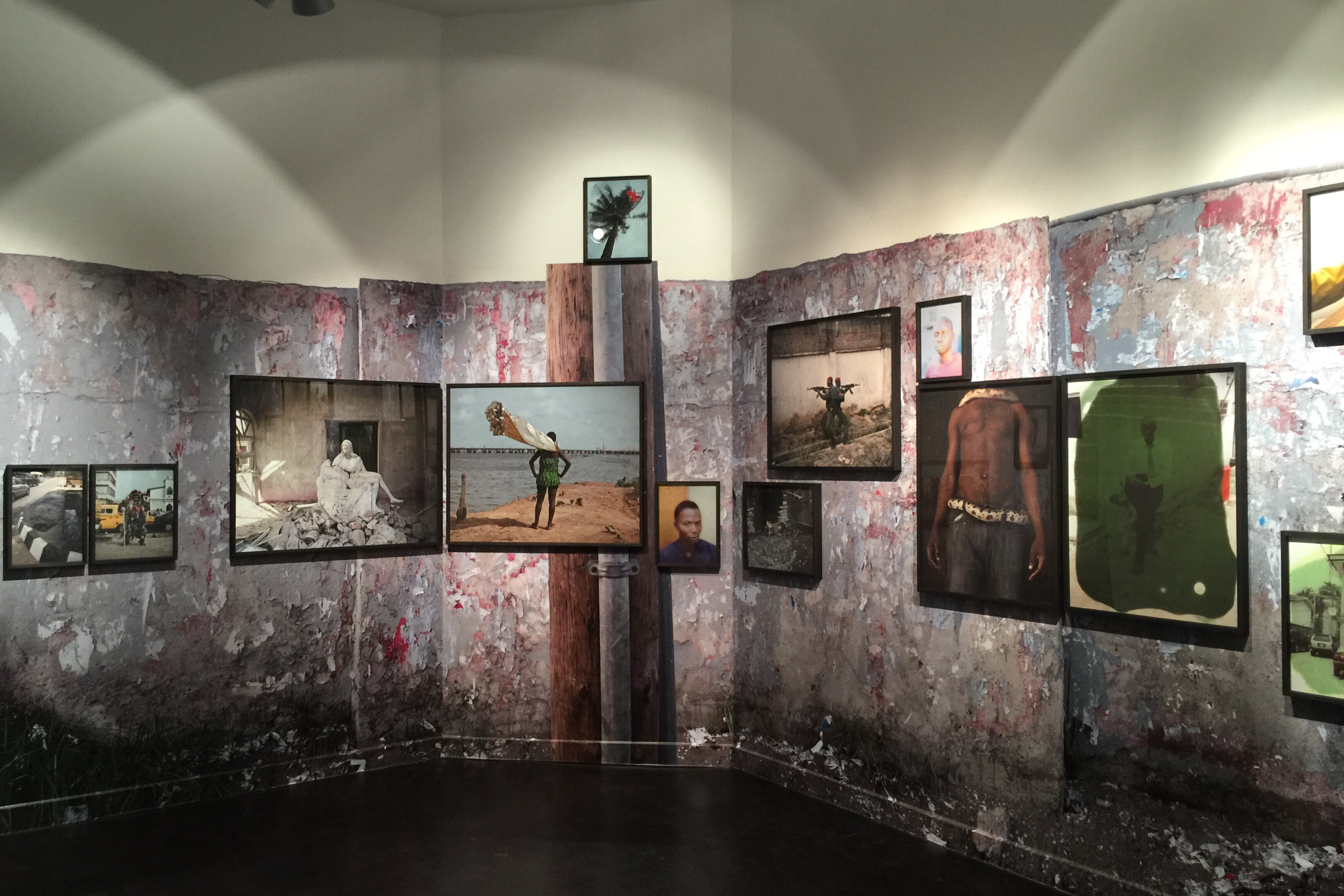
Gilles Peress ‘Whatever You Say, Say Nothing’

Although the photographs were taken as documentary images of the Trouble in 1970s Northern Ireland, this nomination is for a reimagining of the archive which has been published as a book. By grouping images in a fictional timeline or storyline the specificity has been removed from the Northern Ireland context and generalised to the impact of civil strife anywhere. They convey the gritty surreality of life in Northern Ireland at the time but also contain the destructive cycle of time and events repeating themselves with slight variation, seemingly endlessly. The judicious use of words and typography compliments the images very well.

exhibition layout
The First Day. Concertina book. Gilles Peress

Impressions

All four nominees are worthy of this year’s prize. I generally prefer more recently made work but the use of older images in a new or on-going context is perfectly valid. The photographer I would most like to see more work from is Anastasia Samoylova; she’s exploring a contempoary issue in a variety of ways and if winning this prize helps her to continue this project I hope she wins.

Using 35mm film in Hasselblad V Series, Mamiya RB67 (and other cameras too)

I have several A24 magazines for my old V series Hasselblad and a Mamiya ProS back which take 220 roll film. But guess what? Nobody makes 220 rolls any more. I wrote a post on using 120 size rolls in the A24 backs a while back, well here’s another use for those 220-size magazines: 35mm film! If you don’t own a Hasselblad or Mamiya RB67 it’s still worth reading this post as the principles apply to any camera capable of taking 220 film.

UPDATE 2022: my adapters have been tested in cameras other than the Hasselblad and Mamiya, and unfortunately it is not possible to produce a universal design; the ridge needed to make the Mamiya film counter work prevents the adapter fitting in a Pentax 6×7. The Hasselblad adapter will fit the Pentax though. This means that the most general design is the Hasselblad adaptor but another adaptor specific to the Mamiya back is needed for the frame counter function.

A full frame scan from a 35mm negative on Rollei Retro 80S showing the 2.3:1 aspect ratio. Copyright Malcolm Raggett

Aspect ratio and orientation

At the end of the process you will end up with 24 exposures on a full length of 35mm film for the 6×6 format or 20 frames for the 6×7. Each frame is the same length as a normal 6×6 or 6×7 frame (56mm and 67mm respectively) and the full width of the 35mm film. The sides will have perforations of course so the effective width of the film will be 24mm. This gives an aspect ratio of 2.3:1 or 2.8:1. The film runs vertically from bottom to top in a Hasselblad so the image frame is vertical when looking down into a waist level finder. To get a horizontal frame you have to tilt the camera on its side. The Mamiya RB67 film runs horizontally so you’ll get a horizontal frame (and an aspect ratio of around 2.8:1 with the 7cm width, but fewer exposures).

The film runs vertically in a Hasselblad so the frame is vertical by default…
…tilting the camera on its side gets an horizontal image but is awkward to use. This is where a sports finder or a 90° prism comes in useful.
A partly used roll of (scrap) 35mm film in an A24 film magazine. The film runs vertically and is showing slight film curl at the perforated edges. In practice I haven’t found this an issue as the film is flat enough in the centre 24mm width of the normal image.

Film sizes

Comparing the lengths of film for 220-size and 35mm 36 exposure gives approximately 1.6m and 1.5m respectively. remarkably similar lengths. And what about the diameters? A 120 spool is 25.1mm and a 35mm cassette is 25.1mm (not including the light trap, which sticks out a few millimetres). Wow, almost like it was intentional. A quick search of the Internet showed that the 3D printing community had produced adaptors for running 35mm film through rollfilm cameras and since I have a 3D printer I printed several of the open source designs. Unfortunately these didn’t fit my Hasselblad A24 magazines nor the 35mm reloadable cassettes I have, and they wouldn’t advance the frame counter in the RB67 ProS back so I set about redesigning them so that they would work in a more universal way.

3D printed cassette and spool adaptors for Hasselblad A24 film magazine shown loaded and ready for inserting in the back. I printed these in red as this makes the components easier to see. In practice I use black parts to reduce the risk of internal reflections.

Film wind-in

Great. Now I have a set of adaptors that would let me load 35mm cassettes into my A24 and ProS backs. The next issue to overcome is the amount of film wound on to the takeup spool before the camera is ready to take its first exposure: it can be upto 0.5m. With 120 film the initial wind-in is mostly paper backing but with a 35mm cassette the wind-in is all film and this is wasted, leaving only 1m in the cassette to be exposed. This only allows about 16 exposures in the A24 magazines before the film is fully wound out of the cassette. That’s not very economical. What’s needed is a blank leader added to the front of the 35mm film. I cut a piece of clear Mylar film but it would be possible to use an offcut of 35mm film about 450mm long. The overall length of this strip isn’t critical, what’s important is the amount wound back into the cassette, which is none for the RB67 ProS and 200mm for the Hasselblad A24. This leader is taped to the front of the film protruding from the cassette then wound back into the cassette as necessary. By doing this I get 24 exposures from a 35mm film without wasting film on 6×6, and 20 exposures on 6×7 with a little film left over. I found the best tape to use is clear pressure sensitive tape by 3M; it’s nice and thin so doesn’t get caught going through the cassette’s felt light trap and it peels off cleanly when loading the film in a tank.

Attaching a leader to the 35mm film means you can use the entire film to take pictures. I’ve shown Mylar film but you can use a length of scrap 35mm film and tape it to the film in the cassette with pressure sensitive tape. Don’t pull more than 25mm out of the cassette or you risk losing the first frame on the roll. Note the mark at 200mm from the join.
I’ve been a bit too generous with the amount of film pulled from the cassette. Limit it to 25mm if you can. Tape the film to the leader with pressure sensitive tape and rub down the edges with your fingernail so they don’t catch in the light trap. Putting the tape at a diagonal helps with this too.
Wind the leader into the cassette up to the 200mm mark. This is now ready for loading into the Hasselblad magazine. The Mamiya RB67 ProS 220 back doesn’t need any leader wound back in.
Here’s the insert ready to install in the Hasselblad magazine
Note the orientation of the cassette so that the sensitised side of the film is facing the lens when it’s wound on. This is a Hasselblad insert but the same is true on the ProS back.

Film loading for processing

The last problem to overcome depends on how you load your film for processing. I have both daylight loading and darkbag loading tanks so I thought I’d make a system for both. If you use a daylight loading tank and don’t have a darkbag you need to be able to open the A24 film magazine in daylight. You can’t do this unless the film is wound into another cassette, so you’ll need a supply of empty re-loadable re-usable 35mm cassettes. But before you rush to buy them, it’s my experience that using them adds significantly to the friction in the film wind-on mechanism. Although the Hasselblad is a robust camera they are getting old and I feel uncomfortable applying this extra force to my equipment, so yes, it can be done but I would advise against it. My preference is to load to an adapted 120 spool and unload the magazine in darkness. You may be forced to wind into a re-loadable cassette if you don’t have a darkbag or if you want to expose more films than you have magazines (or if your camera only takes one film at a time). In this case you’ll need two pairs of cassette adaptors instead of one pair plus spool spacers.

Loading the film from an adapted 120 spool into a processing tank is the same as a normal 35mm film except for two things: it’s not in a cassette so expect the film to spring off the 120 spool when you take the tension off, and remember to separate the leader so you don’t wind it into the tank with the exposed film.

What other cameras are likely to work?

Here’s a list of cameras that can take 220 size film, either via a discrete back like the Hasselblad, or by flicking a switch:

Hasselblad V series with A24 back*
Asahi Pentax 6×7
Mamiya 645 with 220 film insert
Mamiya 645AF with 220 back
Mamiya C220 C330
Mamiya RB67 with ProS 220 back*
Goodman Zone and Axis (since these take the Mamiya ProS backs)*
Mamiya GX680 with 220 back
Fuji GA645
Fuji GSW680 GSW670 GSW690
Voigtlander Bessa III (aka Fujifilm GF670 in Japan)
Bronica RF645
Bronica EC-TL
Rolleiflex TLR
Rolleiflex SL66 with switch on film backs

*These I known to work with adaptors

You cannot use a camera that relies on a small red window to position the film using numbers printed on the film backing paper: there’s no backing paper and the window would need to be taped off to prevent the film being exposed.

Where to get the adaptor set

These are the 3D printed parts you will need. There’s a pair of adaptors for the 35mm cassette and four half-round spacers to glue to a 120-size spool.
And here are the spacers glued in place. These cassette adaptors are for Hasselblad only and may look the same but they are not – they only fit one way around on the cassette.

If you have a 3D printer you can download the print file for Hasselblad at Prusaprinters.org and print your own. There are also other designs on thingiverse. The design is free for personal use under Creative Commons BY-NC-SA. If you don’t have a 3D printer you can buy the 3D printed parts from me via eBay which I guarantee will work with Hasselblad A24 and Mamiya ProS 220 magazines.

Impressions from the Contemporary Artists’ Book Conference 2021

About 150 people attended this year’s Contemporary Artists’ Book Conference, 26-28 February. It was held virtually but was organised by the Center for Book Arts, New York, and the majority of attendees were American. I could identify activists, artists, academics and archivists (plus a few others whose title didn’t begin with A).

It was great to go to a conference I couldn’t normally justify the expense of attending but one of the disadvantages of virtual conferences is not being able to network with other delegates. This means my impressions are solely based on the seminars I attended and my personal interests, so rather than give a report on what happened I thought I’d record my thoughts as stimulated by what I saw and heard.

Although the theme of the conference was The Temperature of Art Book Criticism and Scholarship several of the sessions I attended strayed well away from this. In hindsight, a common thread that ran through them was about the marginalised nature of the book as an art form and some of the tensions that arise from this.

The premise of some speakers was that improving criticism1 and scholarship around artist books would improve their legitimacy. These speakers talked in terms of developing critical frameworks and vocabularies, but not many of the practicing book artists appeared terribly interested in this, seeming more preoccupied with creating books, funding and running projects, and gauging the impact of their work on readers.

It seems to me that there is a difference in the skill set needed to be an artist and the skill set of a critic. That’s not to say a person can’t do both things, just that they are very different. The creation of an artwork tends to be more right-brain, the analysis needed for critical evaluation tends to be more left-brain, which I summarise in this Venn diagram (I may have underestimated the overlap but you get the idea I hope):

Nobody contested the idea that improving artist book criticism would be a good thing and could improve the standing of the artist book but it struck me that many of the artists and activists producing books may well have been attracted to the medium precisely because of its marginal, outsider, few-rules status. If artist books suddenly became a mainstream art would they still be attracted to it as a means of protest and social criticism? Something would be lost but would the gain be worth it?

Overall the conference raised more questions than answers. To me that’s the mark of a successful conference. I’m glad I didn’t have to spend much money attending but I’m also glad I spent the time. My thanks go to the organisers and the sponsors whose support made the conference free of charge but definitely not free of value!


Note 1 A critic’s role, as described by Johanna Drucker, is to cut through the ‘stuff’ and direct attention to something special – something worth the reader’s time.

Shape of Light at Tate Modern, London

The exhibition ‘Shape of Light: 100 Years of Photography and Abstract Art‘ is showing at Tate Modern, London until 14 October 2018. It charts photography’s role in twentieth and twenty-first century efforts to explore abstract art but it does it in a rather staid, historical/academic – and expensive – way that gave no clue about the sense of play involved in creating abstract art. Nevertheless it is a good synopsis show that achieves what it ‘says on the tin’.

seated man views abstract photos

Even the staff get to appreciate the art sometimes, though the first 10 rooms of unremitting black & white images did start to get dreary (never thought I’d say that about b&w photos, but there it is).

This exhibition is a journey through photographic abstraction from the early twentieth century to the present. It demonstrates relationships between different photographers and different media, with the occasional painting and sculpture added to the mix. Most of the exhibition is a steady progression through varying approaches to abstraction. When you consider that the primary use of a camera is to record what’s in front of it, using a camera to make abstract photos is fighting the natural characteristics of the medium. In this exhibition we see the world presented from bizarre viewpoints, the use of long focal length lenses to compress perspective and close-ups to distort scale. We also find photographic materials used outside the camera to record the action of light, and even invisible radiation, directly. The first ten of the twelve rooms are almost entirely black & white prints.  I hate to say this as a black & white enthusiast, but ten rooms of black & white abstracts did start to become kinda’ boring. But then finally as we approach the 21st century colour starts to happen. Hurrah! It starts as a dark blue whisper of large format Polaroid prints then finally, finally bursts into the exuberance that can be abstract art. It’s true that colour film wasn’t available in the early 20th century and unfortunately there was an almost universal attitude that serious photographers only made black & white images – and what a missed opportunity that was! Rooms 11 and 12 of the exhibition seem to conflate colour film and digital technology as a single giant leap away from photographers worthily pursuing abstraction to artists playing with photographic means to create abstract art. With the depth of analysis given in the first ten rooms it felt like the final two rooms were rather rushed and cramped, not in their physical space, which was large, but in their balance compared with the previous part of the show. I feel this is a missed chance to show more of the diverse abstract photography being produced in the last three decades, and the show under-represented the possibilities digital technology has brought to the arena. I swung from feeling turned off by too much black & white imagery to wanting ‘more! more!’ of the latest works.

Broadly the exhibition was organised chronologically, though thankfully not too strictly, and each room had a contextualising statement that could be read or ignored as you please. Although there are well known images by photographic ‘names’ it was good to see these balanced with less well known equals. It was also good to see a sprinkling of Japanese photographers in with the predominant European and American names.

Abstract art is viewed by some people like wallpaper: decorative but shallow in meaning, and using photography to create abstracts can tempt the viewer into trying to work out what it was in front of the camera. The first approach has a lack of engagement, the second is engaged but missing the point. There is a relevant quote buried in this exhibition: when commenting on the title of a proposed abstract photography exhibition in the late 1950’s Minor White wrote to the curator ‘…I think that “towards abstraction” is a dead end for photographers to follow – whereas “towards revelation” is towards life itself.’ [letter from Minor White to Grace Mayer. 1959]. As Minor White implies, abstract images require engagement by the viewer as well as the photographer and without this willingness to engage imaginatively, emotionally and intellectually, this exhibition would be an overpriced expensive waste of your time. But if you want a good assembly of abstract photography set in an historical context, take a deep breath and shell out the £20.

I wouldn’t consider any exhibition worthwhile without discovering a few delights, and this show didn’t disappoint me. A few of my memorable images are:

Iwao Yamawaki. Untitled (Textile Abstraction). c1930-3.

Iwato Yamawaki’s image caught my eye not just for its own quality but for the similarity to ‘Tights‘ (c.2011) by Daido Moriyama. Given the dates it is easy to imagine that Moriyama could have been inspired by Yamawaki.

Chiemsee at Breitbrunn. Original by Peter Keetman. Shape of Light exhibition, Tate Modern

Peter Keetman has an eclectic eye for the abstract image but this one particularly caught my eye. It is on the cusp between reality and unreality, and I think it is this that gives it so many possibilities for the imagination. Is it a landscape? Or perhaps a photomicrograph? Or something else entirely? Unusually for an abstract, it has a strong sense of perspective.

E.I. CTY1. Original by Anthony Cairns. Shape of Light exhibition, Tate Modern.

E.I. CTY1. Original by Anthony Cairns. Shape of Light exhibition, Tate Modern.

I’ve been wanting to see this work by Anthony Cairns since I read about it last year. The images have a hint of the quality of old tintypes about them: quite dark and melancholic, as if uncertain whether to be a negative or a positive. They are an abstraction of reality (but aren’t all photographs?) ‘though anchored in reality so not fully abstract, but definitely worthy of a place in this show. I like the way the multiple shadows caused by refraction through the acrylic mounts gives the images another dimension too.

Awoiska van der Molen: Sequester

In short, Sequester is one of the best Photobooks I’ve seen in a long time. Here’s why…

Sequester the book

Awoiska van der Molen’s book Squester

…I use a 5-point scale when I’m deciding whether I like a cup of coffee (Yes, this is a photo blog not a coffee blog, but bear with me). Here’s how it goes:

  • Yuk, tip it down the sink
  • Nah, that was too much of an endurance test
  • Well, someone might like it but it’s not for me
  • Hmm, nice but rather 1-dimensional; something’s missing or dischordant
  • Yummy, I could drink that again!

Then I realised I use pretty much the same criteria when I’m reading a photobook or visiting an exhibition. I know others who are more analytical in their approach, and a lot of people who are less so. As a practitioner I know that there is a danger of over-analysing my own work, at least while I am creating it, but I think that at least some enquiring thought about my own and others’ work helps me learn and improve, so I shall try my coffee criteria on photography for a while and see whether it works out.

There aren’t many coffees photobooks that make it to the Yummy point of my scale but Sequester is one of them. The title comes from Awoiska van der Molen‘s desire to isolate herself on the Canary Islands with a camera and film for periods of introspection where she seems to be using landscape and the photographic process as a metaphor for her thoughts and a process for artistic development. She acts instinctively while taking the images and enjoys the delayed gratification of film processing but this also allows her mind to work on the memory, so post-visualisation is an important part of her work. All the images in this book are consistently melanistic (to use an appropriately organic term) but in this instance I don’t find the dark tones depressing but rather they inspire me to look more closely, to enquire more deeply into the hidden detail of the shadows and to appreciate the rare quality of the few highlights. Van der Molen describes her images as not so much representing a moment in time but more part of a continuum; evoking a mood is what she aims for.

Awoiska van der Molen speaking at The Photographers' Gallery, London

Awoiska van der Molen speaking at The Photographers’ Gallery, London, recently

She photographs in short bursts of about 3 weeks at a time. The first week is spent exploring then by weeks 2 and 3 she is ready to be productive. For the images in Sequester she returned to the Canary Islands several times. It is hard to say why she responds to some landscapes and not others but Spain and The Canaries appeal whereas Italy, for example does not. It seems to be related to the impact that man has had: she prefers a light, understated influence rather than obvious layers of history.

Original photograph by Awoiska van der Molen

Images alone don’t make a book – they have to work with the construction, layout, paper, printing and typography, and that’s what makes this book special. The designer, Hans Gremmen, has done a brilliant job on this within the constraints of commercial production. A master stroke was including every third section printed in white ink on black paper. My main criticism is for the way some images bleed across the gutter to the opposite page. This normally ruins the photograph’s carefully considered composition however van der Molen’s primary concern is not for conventional composition but for tones, light and shade, and mood. So in this instance I have to forgive what I normally consider bad practice in the interest of bleeding the image off the edge of the page, which is far more important here as it implies the image being a window into a bigger world.

Sequester is up there with the yummiest of photobooks but if photographs are inherently history then photobooks are even more so (Sequester took about 3 years to publish). Awoiska’s photography has evolved since these images were made and I look forward to following this artist’s journey through her personal landscapes in the future.

Matej Sitar’s page-turning video of Sequester is at https://vimeo.com/122460044

Awoiska van der Molen has images on show at The Photographers’ Gallery, London, as a nominee for 2017 Deutsche Börse Photography Foundation Prize until 11 June.

Wolfgang Tillmans: 2017, a world of fascination

Wolfgang Tillmans’ current exhibition is on at Tate Modern in London U.K. until 11 June 2017. There are 14 themed rooms filled with work from the period 2003 to the present, so not a true retrospective and Tillmans isn’t presenting it as such.

Tillmans uses the height available in the Tate Modern's exhibition space. photo ©Malcolm Raggett

Tillmans uses the height available in the Tate Modern’s exhibition space. photo ©Malcolm Raggett

He’s saying ‘here’s what I’ve been fascinated by over the last 13 years  and what’s inspired me to make my work.’ This period coincides with the widespread rise in digital technology both in photographic reproduction and in life in general. This has acted as inspiration and catalyst for a lot of the work in this exhibition. For example, there are two mural-size high resolution images of the ‘chaotic analogue static’ pattern displayed on a digital TV when it is not tuned. These invite close examination and ask when is a picture not a picture? In fact ‘where are the limits?’ is a frequent refrain in Tillmans’ work.

Mural sized images invite close examination. photo © Malcolm Raggett

Mural sized images invite close examination. photo © Malcolm Raggett

Tillmans has had a long-held belief in the purity of the unframed image (his words) [1] and many of the images in the show are clipped to or taped to the walls. There are some framed images though, and it is interesting the effect this has, especially when the two types are mixed: the unframed images seem to be more about the subject and idea and feel like a raw work-in-progress whereas the framed prints have the air of stand-alone finished art objects. Initially this juxtaposing of framed and unframed is unfamiliar and disquieting but is part of Tillmans questioning of how meaning and charge can be incorporated into an industrially produced image, a question that flows through the whole exhibition and extends from the theorist Walter Benjamin’s concept of aura [2].

There is an old aphorism that goes ‘never let the facts stand in the way of a good story’ that applies in varying proportion to many parts of the media, but in 2004 it was show beyond reasonable doubt that the widely-held belief that Iraq had weapons of mass destruction, which was the main justification for invasion by western powers, was incorrect. For those who had any lingering doubt it demonstrated that governments, too, could not be relied on to produce accurate information and that any criticism of the media by government was a case of the pot calling the kettle black. There were also numerous lower profile cases of misinformation by vested interests around the globe and it was probably Tillmans increasing awareness of this that prompted him to set up his Truth Study Center [sic]. He originally declared that the Truth Study Center  was set up to examine ‘our desire to find a universal truth and the impossibility of doing so.'[3]. In late 2005 he released a book of the same title and included work in an exhibition at The Serpentine Gallery, London, made up of

groups of photographs, cuttings from newspapers and magazines, pamphlets, advertisements, all kinds of printed matter, which he presented not on the wall but under glass on narrow custom-made wooden tables. Under the collective title Truth Study Center, they drew attention to the exercise of power behind the ideologies of Islamic fundamentalism, Catholicism, capitalism. He has subsequently included a version in various installations, adapting the subjects depending on the venue. [4]

So even in the early days of the Truth Study Center there was an intent to reveal specific alternatives to any official truths or myths, and he departed from a purely photographic medium to do so. The continuing need for such work is only emphasised by, for example, the current battle between the US presidency and the media over ‘facts’. There is certainly plenty of material for Tillmans and he uses it to strong effect in room 4 of his current show; it is the largest and most densely-packed of the rooms. The presentation is the same as at the Serpentine with cuttings, photos and printed matter in glass-topped tables laid out in a way that invites the viewer to browse. It would be easy to spend an hour in this room alone if you are happy to read text as well as pictures. It is informative, fascinating and worrying. Tillmans reveals, if we didn’t know already, that the only ‘universal truth’ is that there is no such thing!

Abstract images have long had a fascination for Tillmans. He started experimenting with abstraction while at school [5] and sees it as a process of taking photography to its maximum potential [1] unfettered by the requirement to be representational, an assumption that viewers frequently make when looking at a photographically produced image. Many of Tillmans’ abstracts are not even made with a camera and yet such is the human desire for metaphor that most people will try to find a representation of this world in pure abstract photographs. It reminds me of this or that is a frequent reaction to abstraction, which shows that the viewer is engaging their imagination when faced with the image and not just passively accepting the image as-is. Only one room is devoted to abstract images, though they occur throughout the exhibition, suggesting that Tillmans has reduced his interest in this area of work. But then something has to give way to the variety of other work, and too much abstraction is exhausting for the viewer, so although I enjoy Tillmans’ abstracts, I think he has the balance about right in this show.

The exhibition notes are a brief but well-written introduction to each room. Photo © Malcolm Raggett

The exhibition notes are a brief but well-written introduction to each room. Photo © Malcolm Raggett

With fourteen rooms and at least this many themes, there is so much complexity in the show that a lot more could be said. I’m going to finish up, though, with my last thought about Tillmans’ fascination with materiality and particularly paper. As an artist using photography it is not surprising that he’s interested in the material world: cameras are an exquisite tool for examining this. Less obvious to me is his claimed interest in the material qualities of paper [5]; paper is used extensively throughout the exhibition – it is the main base for all the works, but with a few exceptions it is not the materiality of paper that features here, at least not to my perception. As someone who is also fascinated by paper I would love to see a Tillmans show devoted to this topic. Maybe next time?

2017 is an engaging exhibition by an eclectic artist that is well worth visiting. There are lots of ways to read it at different levels; It is certainly worth going beyond the themes of the rooms and thinking about other unwritten strands that span the rooms. I’m looking forward to Wolfgang Tillmans’ next show already!


  1. Tillmans, W. 2010. From the Archive: In Conversation-Wolfgang Tillmans. https://photoworks.org.uk/conversation-wolfgang-tillmans/. Accessed 2017-02-16.
  2. Benjamin, W. 1936. The Work of Art in the Age of Mechanical Reproduction (translated).  https://www.marxists.org/reference/subject/philosophy/works/ge/benjamin.htm. Accessed 2017-02-18.
  3. Anon. Taschen marketing material https://www.taschen.com/pages/en/catalogue/photography/all/01363/facts.wolfgang_tillmans_truth_study_center.htm. Accessed 2017-0219.
  4. Jobey, L. 2010. Wolfgang Tillmans: the Lightness of Being. in The Guardian. https://www.theguardian.com/artanddesign/2010/jun/26/wolfgang-tillmans-serpentine-photographs-exhibition. Accessed 2017-02-19.
  5. Anon. 2017. Wolfgang Tillmans 2017 Exhibition Notes. Tate Modern.

Christopher Thomas: New York Sleeps

newYorkSleeps

The cover of New York Sleeps by Christopher Thomas. 310 x 285 x 23mm. 160pp. Revised and expanded edition 2016. Prestel Verlag. My first impression is of a New York that I don’t recognise. Sure, I recognise the places, but where are the people? As Frank Sinatra sang: “New York, New York. I want to wake up in a city that never sleeps.”

Right from the start this is a disconcerting book. There is a consistency of vision and technique that makes it a single body of work even though the photographs span 8 years. The sequencing of the images is clear and evidential in its logic, and the print and paper quality is gorgeous. Including the Polaroid film edges in every image give them a ring of authenticity and leads us to make the assumption we are seeing the whole, unadulterated image, and yet the lack of people gives them an other-worldly feel. The more pages I turn the more I have a premonition that some terrible instantaneous event has happened to make everyone disappear while leaving the lights on and the fountains running with only the camera remaining as witness. It’s not so much New York Sleeping as New York Depopulated.

The more I read New York Sleeps the more I find a number of tensions running through it: these are black and white images of a colourful subject but is this done for artistic purpose or to give a documentary impression?; there is a studied static feel to the images, which shatters our preconception of New York as a dynamic city; finally the lack of people lends the images a dream-like surreal atmosphere that is heightened by the time exposure blur in many of the photos.

timesSquare

Times Square. Not a typical image from the book, but one of my favorites. It breaks the rules: the highlights are bleached out, the greys carry little information and the main centre of attention is a trash can. Could it be aliens landing? 

After several readings I began to see it increasingly as a work of fiction (or perhaps ‘dream’ is a more appropriate word, given the title) so I decided to treat the book like a storyboard for a movie. It provides the raw material for the readers’ imaginations to find their own answers, make up their own stories and resolve the tensions. To treat this book as a linear set of sequenced images (as good as they are) would be a waste; there are layers beneath this that are worth exploring and for this I would definitely recommend it.

Thomas Mailaender’s Gone Fishing

Thomas Mailaender is one of my favorite photographers, although he is really better described as an artist. He has the ability to work on quite serious subjects in a humorous irreverent way. A fine example of this is his Gone Fishing project from 2010 that resulted in a book published in 2012. I didn’t review it at the time but a recent visit to Roman Road gallery, London, where the work is on show (until 15 April 2016), prompted me to buy a copy.

GoneFishingBookCover

Thomas Mailaender’s book Gone Fishing. soft cover. A4. 39pp. Numbered edition of 500, 1-299 in French, 300-500 in English.

The work is fictional but is rooted in Mailaender’s own impending fatherhood at the time and, as with much good fiction, has the ring of truth, or at least credibility, about it. The work contains a series of letters and photos from Thomas to his long-suffering partner, the pregnant Marion. Thomas has decided that he cannot face the responsibility of being a father and has taken off on an long fishing trip to various parts of the world; a kind of extended stag party for the dad-to-be.

Each letter home is short and accompanied by a postcard-sized image of Thomas and his latest exploit but done with a subtle tongue-in-cheek humour. For example, alongside a picture of Thomas with a dead shark are the words

Sorry, but I needed to think about all this far from you and the baby. Soon I’ll be a father… It keeps turning around in my head and this little escapade is doing me a lot of good (I even caught a shark) and I think that now I feel ready for us to have a little girl together. I’ll be as promised in Paris Thursday evening.

A few letters later and he still hasn’t returned. He says

…I caught this superb 2.5kg sea bream. I can tell you I had to fight like a devil to get it. The poor beast struggled for over three quarters of an hour and the whole time I thought of you.

And in another letter

I found this superb thistle (in the photo). I spent a long time observing its most minute details: its striking vegetal beauty, the intense purple of its flower and the fine down that covers the slender stems almost make you forget the threatening needles at the end of the leaves. Don’t take it badly, but this plant reminds me of you.

Thistle image from Thomas Mailaender's 'Gone Fishing'

Thistle image from Thomas Mailaender’s ‘Gone Fishing’. 2012.

The metaphor is obvious so it’s hardly surprising that he constantly complains he hasn’t had a reply from Marion! I bet she is purple – with rage.

The photographs all have a cheap snapshot aesthetic. Some of them look genuine while others have had Thomas’s face pasted in to what I assume is an image found on the Internet. This is all good – it adds to the humour and fiction of the work. Mailaender has taken the trouble to match the lighting on his face to the lighting of the found photograph so there is some skill behind the apparently artless snapshots.

The letters all have the theme of love for Marion and the intention of returning home very soon but expressed in such a way that the reader quickly gets the idea that there is a gulf between Thomas’s intent and the reality of his trip: he is enjoying himself way too much! This echos the conflict that many feel between the part of us that remains a child and the internal voice of the responsible adult that comes to dominate as we grow up. But the book doesn’t resolve this in Thomas’s case: we are left on a cliff-hanger as he wins a large sum of money which allows him to continue his escapist vacation. We wonder, will he be an absent father forever?

The exhibition and the book have the same content but the exhibition presents each letter alongside its accompanying photograph whereas in the book the letters and photos are printed single-sided, making them less of a pair. The letters are printed on a lighter weight paper and given the appearance of having been folded for the post. The photos are on a paper of similar weight to a high street photo processing machine with a gloss varnish over the image to enhance this impression. Printing the letters and images on separate sheets means that they cannot be viewed as a pair, which is an aspect of the exhibition that I liked. But this is a minor criticism and the book is still an entertaining, humorous and thought-provoking read.


Masahisa Fukase: solitude or loneliness?

The show ‘Solitude of Ravens’ at Michael Hoppen Gallery, London (until 23 April 2016), has a bleak mid-winter feel. A profound sadness pervades Fukase’s images which were made over a ten year period following the photographer’s divorce. The images speak not just of solitude or being alone but of a deeper loneliness that may have become – or been caused by – a long-lasting period of depression.

MasahisaFukase-1

The photographer Masahisa Fukase peaks at us from between two Raven images

I can imagine the photo series starting as a means of working through a traumatic period but inadvertently becoming a brake on emotional recovery; as if the photographer is mired in a self-perpetuating cycle of depression rather than finding an upward recovery towards a happier springtime.
The motif of the unfairly maligned raven recurs through the series as a bird of ill omen. The birds are frequently depicted in silhouette like shadow puppets subject entirely to the external control of the puppeteer, alluding to the lack of control the photographer may feel over his own life.
Sharpness and definition are rare commodities in these images, which are more about mood than content, about emotion rather than fact. There is a muted tonal pallet: black shapes and grey textures dominate even in the non-Raven images.

MasahisaFukase-3

Limited tonal range, blur and grain typify the images in ‘Solitude of Ravens’

The photographs are not sequenced but several are placed close to each other to emphasise their similarity. Fukase originally made the series in 1982 but the images here are a re-working by a friend of his, with some additional ones. Most of the photos are printed beyond the image frame giving a rough-edged look with a hint of 35mm film perforations, reminiscent of a frame from a movie or a keyword chosen from a sentence: a staccato summary of a bleak period in life.

MasahisaFukase-2

The show is not ordered like a narrative but there is an association of pictures that seem to speak to each other

Masahisa Fukase died in 2012 after being in a coma for 20 years following an accident. One is left with the distinct impression that his was not a rich and happy life. But the show is a masterful demonstration of how photography can be used to evoke emotional intensity and as such is well worth seeing.

Charles Petillon: Invasions

On show for a brief period at Magda Danysz Gallery, London, was the sculpture and photos of the French photographer Charles Petillon. Petillon is a commercial photographer but the exhibition showed his personal work. Inflated white balloons of various sizes are placed or squeezed into various locations, often with associated lighting. They are fascinating interventions in space that play with scale in a fun way; an approach that has lots of potential for the future.

CharlesPetillon-2

Part of the Charles Petillon exhibition. You can just see some white balloons through the doorway on the left

The sculptures can be like clouds or foam or bubbles, or like droplets of liquid before they coalesce. The installations are transient but preserved as photos, which become the artwork. Or another artwork really. Although not a new concept (c.f. the works of Richard Long or Andy Goldsworthy), the photograph becomes the work rather than simply a record of an ephemeral installation.

CharlesPetillon-1

Petillon uses the landscape, the built environment and interiors as spaces for his sculptures

Petillon plans to continue with his balloon sculptures internationally over the coming years, so keep your eye out for some fun!

Paul Graham: I turn a set of photos into its own world

Mack Books organises events in collaboration with Waterstones bookshop to promote some of their new photobooks. These are not simple “come and buy the book” events but have the format of conversations between a photographic critic, historian or curator with the photographer. This gives an insight into the photographer’s working practice and some back story to the book.

On 29 August 2015 Paul Graham (b. 1956) was in conversation with David Chandler to coincide with the publication of The Whiteness of the Whale. Paul is British but had been a frequent visitor to the United States before finally moving to New York. He felt it necessary to acclimatize to the US but needed to be an outsider looking in.

He describes his work as an unfolding thought process rather than a story or narrative. His process is to “edit the world into a set of photos then turn this set into its own world”. His work has to progress and change for his own interest to stay alive and grow. He keeps an eye on what’s being done, especially regarding photobooks, but does not copy or appropriate others’ work. His new book The Whiteness of the Whale evolved into a trilogy but was not planned this way – it emerged as the project progressed.

He does not see his books as documentary despite being labeled as such by some. Rather he sees photographic fact and fiction on a continuous scale with his books somewhere between the extremes.

He prefers working with multiple images and is positive about his perception that more people are seeing the book, the whole body of work, as the art form rather than the single picture on the wall. Nevertheless, he says that the book isn’t the artwork, it’s the container of the work but is sympathetic to the work.

The titles of Paul works often have literary connections (in the case of Whiteness of the Whale it’s Moby Dick) but come later in the project. They are not part of the picture-taking process but become part of the work at a late stage.

Linda Lashford’s Songlines

Linda Lashford travels for a living, and photographs as she travels. Hers are not simple documentary records of places though: Linda photographs by theme and the images in this exhibition “Songlines” are grouped into Intimations of Landscape, The Splintered Coast, and Trappings of Light. Her images are on display at the Joe Cornish Gallery, North Yorkshire, UK until 23 September 2015.

As you might guess from the title, Intimations of Landscape are intimate semi-abstract photographs of aspects of landscape such as water, distressed paint or mist using a limited tonal range and colour palatte. Most show close-up details that imply much larger landscapes.

4 images by Linda Lashford

4 images from Linda Lashford’s Intimations of Landscape series.

Most of the 12 images in this series have little in the way of compositional elements to hold them together or guide the eye; the viewer is left to wander through each image and imagine what lies beyond the frame. These aren’t images of something but rather about something. That “something” is really for the viewer to decide based on the emotions and memories the images evoke. The images hover between a physical reality and a spiritual plane. As Minor White would have said: it’s not what is photographed that’s significant but what else is photographed.

3 images from The Splintered Coast series by Linda Lashford

3 images from The Splintered Coast series by Linda Lashford

The Splintered Coast contains 6 studies of the coastlines of Cornwall, South Wales and Brittany. Of all Linda’s images these are the most anchored in reality, the most literal of the themes. Unlike her other series, most of these contain horizons – perhaps it is this horizontal reference plane that implies the reality and makes it difficult to make the mental jump to any metaphoric plane. Instead I found myself comparing the similarities and differences of the coastlines depicted, which made it, at least for me, the least satisfying of the series.

The beautifully titled Trappings of Light series was taken in an abandoned cork factory in Portugal. “Oh no, not another abandoned-factory-stroke-urban-decay project” you may be thinking. Well no, it isn’t another me-too project about decay; Linda’s control of the photographic process and her eye for isolating and composing details out of visual noise show their strength in this series of 8 images. Form and texture interact with controlled abandon; there is light and shade but the highlights have detail and the shadows never block up. The light is without doubt trapped by these images and give pleasure and intrigue to the viewer that, like Intimations of Landscape, is rewarded by lingering with each photograph in a meditative frame of mind.

6 images from Songlines

Top row: 3 images from Trappings of Light. Bottom row: 3 images from Intimations of Landscape. Photographs by Linda Lashford

Songlines is a varied and satisfying set of images from a talented photographer. My only reservation isn’t about the images but about their display: the presentation and framing of each image is excellent but the hanging splits the series between walls and floors in the gallery, making them less coherent as bodies of work, and appears to associate images by superficial visual similarity rather than developing an underlying theme or narrative. This is understandable as the gallery is quite crowded with images from various photographers and tends towards a hard-working emporium of pictures rather than an art gallery, but it is a commercial enterprise and if that’s what’s needed to keep it running then I’m not going to knock it. Just control your expectations if you go there – and I recommend that you do!

Clare Strand: performance photography

Clare Strand's Getting Better and Worse at the Same TimeGrimaldi Gavin Gallery, London, are currently showing Clare Strand‘s latest photographic works (ends 6 June 2015), which they describe as revealing “Strand’s discordant relationship with the photographic medium, exploring its promise and limitations through unexpected and eccentric means.” Such a description has me rubbing my hands in anticipation and I wasn’t disappointed: I loved the sense of directed play and the irreverence towards “art”, which is something I wasn’t expecting at a gallery situated in an area of London renowned for being rather affluent and well-heeled.

Although there isn’t much time left to see the show, leaving it until the end has the advantage that you will see more output from The Entropy Pendulum. This pendulum has a foot designed to scour the surface of a print in a central stripe. The print is changed each day and the one from the previous day put on display in one of the 35 waiting frames. The original images are not Strand’s but have clearly been chosen for their centred composition, which means the pendulum abrades and corrupts the original meaning, giving it a new meaning. Although I could intepret the images individually I couldn’t make any sense of the sequence, narrative or developing concept, which I think is a trick missed. Though it’s entirely conceivable that it was just me who missed this final point.

Clare Strand's Entropy Pendulum and the display of resulting prints

Clare Strand’s Entropy Pendulum and the display of resulting prints

The Entropy Pendulum in action

The Entropy Pendulum in action. I was attracted to the dust generated by the abrasion of the print’s surface

Rubbings is as close as Strand gets to conventional photography: she photographed the bifurcation points of trees, printed them life-size then pinned them back on the trees for a time thus letting nature create the art, and she photographed the prints on the trees from a little further away. On display were the now-weathered prints from the trees twinned with the record of the work in progress. As an experiment in random decay it’s OK I suppose, but what elevated it for me was its unintended juxtaposition with the concurrent exhibition by Robin Maddock and Benedicte Kurzen at TJ Boulting Gallery, which I saw the same day (see my review here). The latter also examined time/decay of photographic objects, and the two works together were particularly resonant.

The Happenstance Generator went even further into randomness with a selection of small images blown about as if by the wind followed by a short period to allow them to briefly settle before being blown about into another random sequence.

The Happenstance Generator

The Happenstance Generator (and a strikingly red sofa)

The Hapenstance Generator maintenance log

The Hapenstance Generator maintenance log. Not content with playing with photography, Strand is also happy for us to see the artwork warts-an’-all!

As a microcosm of the random images we see everyday blurring past us and occasionally visible to our conscious mind, it makes its point well. I had expected to see a random display of images that the viewer could develop a story from during the quiet dwell time of the apparatus but unfortunately the dwell time was too brief for me to grasp more than a couple of images before they were whisked off again into the vortex of the machine, which is a shame because a small adjustment to the timer could have allowed this extra level of interaction and engagement of the viewer’s imagination. So a great concept falling just short of great implementation, well for me at any rate.

There were a couple of other works on show but I’ve gone on long enough. I call her art Performance Photography in the sense of performance art and in this too she is pushing forward conceptually. Suffice to say that I think Clare has a playful and insightful imagination that resonates with my own ‘world view’, and I look forward to seeing more of her work!

Shine Ur Eye: walking a tightrope

In the basement of the T J Boulting building in London is a crypt-like space used for photo exhibits. Currently (until 27th June 2015) there is a chimeric show from photographers Christina de Middel, Benedicte Kurzen and Robin Maddock that is well worth a visit. In the first gallery are photos  from a collaboration that has produced a pictorial essay of Nigerian daily life. But this isn’t documentary  or reportage, rather it is a mix of straight, manipulated, fictional and surreal images. It treads a tightrope between reality and fiction, between sanity and madness. It is playful but never demeaning to those depicted or Nigerians in general. At the end of the display the viewer is left on another tightrope: on one side is an invitation to visit on the other a health warning!

Shine Ur Eye main space

The main gallery is wonderfully decorated with wall wallpaper.


Attached to the main gallery is a dark low-ceilinged space and entering it is like passing through a portal to another land. Here we find images in various stages of decay from the Museum of Lagos’ archives. The original images are photographs of ethnographic objects that have been stored inappropriately and so are showing signs of decay, reflecting the care/priority that the museum and by implication the Nigerian government gives to preserving its heritage. With faces dissolving back into the Rock they were carved from and mould creeping around the edges of basketwork, we also have the generic metaphor for the eventual, inevitable decay of all cultural evidence thus questioning what the value of an archive really is.

the second gallery at T J Boulting

The crypt-like space showing semi-decayed images from the archive of the Museum of Lagos.

There are two exhibitions here, related by geography but separated by time and concept. Do try to make the time to see them both if you are in central London.

What a photofest weekend! Photo London and Offprint London

The bank-holiday weekend of 21-25 May 2015 saw a raft of photographic happenings in London. The two big ones were Photo London and Offprint London. I attended both. Was it worth it? You bet!

Somerset House

Somerset House, home of Photo London 2015.

Photo London was based at Somerset House, had 70 galleries from 20 countries participating, along with 10 publishers and 3 special exhibitors. For me this isn’t a huge draw as I find the gallery scene rather rarefied and certainly out of my price bracket, but it’s a good opportunity to take the pulse of the photography collectors’ market and to see which names and styles are in vogue at the moment. It is not a free show; the entrance fee is pitched high enough to keep away the casual viewer and other oiks like me who can’t afford gallery prices. Nevertheless, I took the plunge and spent 5 hours immersed in some wonderful images.

Somerset House made an excellent venue, with its characterful small but linked rooms with lots of wall space making it ideal for the various galleries to display. Being split over 5 floors meant getting plenty of exercise on the stairs, though less than ideal for those with mobility difficulties. There were a few galleries selling historic images but the majority were promoting contemporary photographers. For me this balance was about right. The V&A also had a well-curated display of images from its collection called Beneath the Surface that continues until 24 August 2015.

Guns Love. 2014. Thomas Mailaender. cCopyright the artist.

Guns Love. 2014. Thomas Mailaender. Copyright the artist.

There were, of course, a huge number of excellent images (as well as some I wouldn’t give wall space to). If I have to pick one stand-out artist it is Thomas Mailaender‘s cyanotypes on the Roman Road stand. Although all the images used the cyanotype process the images were not process-driven but displayed a repertoire of playfully diverse ideas executed in an original but not gratuitous way.

Offprint London

Offprint London in the Tate Modern Turbine Hall

Offprint London was my main interest because of my long-running enthusiasm for the photobook. Several people I spoke to said that it was very similar to Offprint Paris in size and scope, though I noticed that some of the more established publishers had decided to exhibit at Photo London instead of Offprint. It was great to see indie publishers from across Europe and even a few from across The Pond! Not all exhibitors showed photobooks but these I just ignored.

There has been a huge increase in the number of photobooks produced recently compared with only 10 years ago, and the number of exhibitors and the size of the crowds at Offprint only serves to reinforce this. Unfortunately there has also been a huge increase in the number of poor photobooks, and Offprint had its fair share of those too. It’s great that photographers want to make photobooks and we all have to start somewhere but some of the work here shouldn’t be inflicted on a wider world. There is too much ego-driven publication and not enough art or craft value in a lot of photobooks today. Having got that off my chest I should also say that there are a lot of good quality books for sale at Offprint. Many are commercially published, which is fine, but it was the artisan self-publishers that took my eye. In particular I liked the work of Jane & Jeremy and Highchair Editions. Their art-and-craft blended approach and interesting design ideas were eye-catching and went beyond what would be expected from commercially-produced books, which is exactly the sort of photobook work I hoped to find at a show like this. So well done to you, and congratulations to Simon Baker and Tate Modern for holding Offprint London – I will definitely attend if it runs again next year!

Speaking of which, Photo London has already announced next year’s dates as 19-22 May 2016. Fingers crossed that Offprint will also repeat.


Christopher Williams’s The Production Line of Happiness

The Production Line of Happiness by Christopher Williams at Whitechapel Gallery, London, (until 21 June 2015) is not an exhibition to wander into unprepared. The images span the period 1981 to 2015 (though some expropriated images are older) and Williams demands as much from the viewer as he has put in over the 34 years he has been compiling this work. But with some work on the viewer’s part it is a thought-provoking and worthwhile visit.

catalogue from The Production Line of Happiness

The Whitechapel Gallery is one of those irritating institutions with a blanket ban on photography so I can’t show you any installation shots. Instead, here’s something off a production line. ©Malcolm Raggett

Williams’s long-term enquiry into what makes us happy/unhappy and how consumerism is designed to give us the illusion of happiness is wide-ranging and, like all good art, is intended to provoke questions rather than provide answers. There is an integrity and consistency to this work and I empathise with Williams’s skepticism concerning consumerism. In the end the work leaves me dissatisfied (and I don’t mean this in a negative sense): okay,I get that happiness is an emotion that we attempt in vain to satisfy by spending on more and more stuff. But happiness is transient anyway – it is always balanced to a greater or lesser extent with, for example, sadness and longing.

For me the void at the end of this work is that it doesn’t continue by addressing the issue of how to substitute a quest for contentment (which I take as a long-term stable state) for the pursuit of happiness. This has set me questioning how I would approach this as a photographic project with a title like “The Hand-crafted Line of Contentment”. Food for thought – thanks Christopher!

=, Human Rights, Human Wrongs

Rather stupidly, I was late in getting to this exhibition, Human Rights, Human Wrongs, at the Photographers’ Gallery, London. I wouldn’t call it a pleasure but it was certainly worth the visit for other reasons.2015-03-23 12.31.40-1

Human Rights, Human Wrongs is a 2-floor, extensive show of densely-packed images from conflict zones from 1945 to about 2000. ‘Conflict zones’ does not necessarily mean war zones: the struggle for human rights is, as you would guess from the title, strongly represented too.

The first gallery deals with the immediate aftermath of war and armed conflict. We don’t see the fighting and there is no glorification of war (thank goodness). Instead it feels more like a visual accountant assessing the costs, but in terms of human bodies and moral degradation.

The second gallery is about conflict of a different kind – civil conflict and the fight for rights or the domination of beliefs. The choice of images emphasizes just how much physical and moral force needs to be applied, by all sides in the conflict, to support or overcome ingrained attitudes, the status quo and vested interests.

The whole exhibition is a presentation of curated evidence, and like any good show leaves the viewer to draw their own conclusions from this evidence. For me, it shows a fundamental truth that, at an animal level, humans are easier to kill than to live with in peaceful coexistence. Yet the Declaration of Human Rights displayed on the gallery’s walls show that our species is capable of more than killing, that ink is more powerful than blood. I also noticed the = sign used on the forehead of some protesters during the American civil rights movement: we should all use this symbol on our keyboards a little more!

Well done to the Photographers’ Gallery for re-invigorating the documentary photograph.

Human Rights Human Wrongs is at the Photographers’ Gallery, London, UK until 6 April 2015.

An essay on the struggle for human rights is on the Photographers’ Gallery blog

Jeff Wall at the Canada House Gallery, London

I came across this show in the Canadian High Commission by accident. I was walking through the north west corner of London’s Trafalgar Square, noticed that the Canada House Gallery had just opened and they’d chosen Canadian photographer Jeff Wall as the inaugural artist. The gallery is open, via a security check, Mondays to Saturdays 11.00 – 17.45 until 15th May 2015.

Jeff Wall's exhibition at the Canadian Embassy, London

Jeff Wall’s exhibition at the Canadian Embassy, London

It’s a one-room gallery and Jeff Wall’s works are decidedly in the over-sized category so you don’t get many to the metre – only five works in this case, plus some blurb. The photos seem too large for such a compact space though that’s the way Wall likes us to experience his images: to become almost part of the scene. Personally, and I would have preferred to see more, smaller works in what is quite a small space, but hey, it’s good to see another gallery opening for the visual arts and displaying photographs.

The images are an eclectic mix with no obvious theme or relationship other than a grab-shot quality to them and yet apparently they are very deliberate and considered. As Sara Knelman says in her leaflet accompanying the exhibition: ‘Wall works somewhere between the possibilities of capturing and constructing the world around us.’

If you are in central London it’s worth popping in to see the photos – and support the Canadians in their effort to open a new gallery space!

OnLandscape conference: craft versus art

OnLandscape, an on-line photography magazine, organised a weekend conference from 21-23 November 2014. I don’t think of myself as a landscape photographer but walking and photography have been synonymous for most of my life so I thought I’d attend. Here are my thoughts.

It's a fungus. No, it's a highly eroded landscape. No it's avast underground city. Yes, it's a metaphor! ©Malcolm Raggett

It’s a fungus! No, it’s a highly eroded landscape! No it’s a vast underground city! Yes, it’s a metaphor!! ©Malcolm Raggett

A glance at the OnLandscape Web site and the type of photographs that many of the contributing photographers take shows the narrow definition of “Landscape” to be expected at the conference. We’re talking “Natural Landscape” here: the urban or built environment is anathema to most of these photographers, as is any sort of environmental activism. The overwhelming aesthetic derives from that long thread stretching back from today’s Joe Cornish and Paul Gallagher (colour and black & white respectively) through Eliot Porter and Ansel Adams to the American Sublime and the English Landscape painters.

Most of the conference speakers (all male, I note) talked about the business, craft and practicalities of their photography, though David Ward considered cultural origins of colour, Rafael Rojas gave an excellent analysis of his approach to fine art photography and Jem Southam showed how he used the photographic process to satisfy his curiosity about contested spaces, narrative and metaphor. Southam’s talk was the closest we got to offering an alternative aesthetic in landscape photography and, judging from my conversations with other delegates afterwards, caused strong division of opinions amongst those who heard it.

Pushing a little harder at this division, there are those who think that a photograph should depict the subject in front of the camera in the most conventionally beautiful way possible. The recent winner of Take-a-View’s Landscape Photographer of the Year was held as an example of this, and two of his prints displayed at the conference did show a distinct tendency towards oil-painting qualities. I didn’t gather opinions from everyone at the conference but my perception is that the majority of those present fell into this “conventional beauty” camp. The concept that what a photograph is of and what a photograph is about can be entirely different hasn’t occurred to many viewers, or that a series of images can be greater than the sum of the parts was only acknowledged in a superficial way (such as a book being a collection of someone’s best photographs).

orange cone by yellow rape

Is it a road cone by a field of rape? Or is it a king leading his army into battle? Oh no, it’s another metaphor! ©Malcolm Raggett

The photograph has a powerful hold in many peoples’ minds as a reproduction of reality. Much has been written to dispel this myth but still it persists, perhaps because that is how most of us serve our photographic apprenticeship: recording photographically as an aid to memory. Yet one of the characteristics that is unique to our species (as far as we currently know) is our use of metaphor. It seems to be inate, starting with children seeing clouds that are shaped like animals through fictions that represent real life, to lines on paper that represent gods. Why then can’t aspiring photographers make the same associations in theirs and other photographs? Perhaps because the photographer never intended it? Or because the viewer never thought to push themselves outside their normal mental comfort zone?

As David Clapp pointed out in his talk, we strive for originality within familiarity but this diagram indicates we are not likely to find it there!

As David Clapp pointed out in his talk, we strive for originality within familiarity but this diagram indicates we are not likely to find it there!

I wonder if Jem Southam’s unuttered plea for delegates to think more deeply about their photography, to let go of the camera-as-craft and use it as a tool of enquiry, will have fallen on deaf ears. If a few people are encouraged along this line of thought then I think the conference will have been a success. It certainly helped me to see the different levels and diversity there is even within the narrowly defined scope of the conference. The conference was subtitled “A Meeting of Minds”; I do hope those minds have been encourages out of their comfort zones!

Processing C41 colour film in black & white chemistry

Summary

I have had promising results developing colour print film in standard black & white chemicals. Not only is it identical to processing black & white film but the fine grain and wide exposure latitude of C41 colour film is preserved in a black & white negative.

35mm colour print film can still be obtained in most city high streets, at least in the UK, and provides an available and low-cost alternative to regular b&w negatives for those willing to process and digitise their film.

The test

I had some out-of-date 35mm C41 colour print film (Kodak GC-400, a cheap, consumer-level ISO400 film, no longer available) and wondered what would happen if I processed it in my normal black & white developer, Rodinal (actually ADOX Adonal, which is identical to the original AGFA formula), so I fired off a roll of the colour film followed by a roll of black & white film at the same ISO400 setting, which I processed in the same chemistry for comparison. I used the same development time for the C41 film as the Massive Dev Chart recommends for Ilford XP2 (a C41 b&w negative film), so if you want to use a different developer go ahead!

The C41 film was given 18 minutes at 20C in Rodinal diluted 1+25, 1 minute stop bath, 5 minutes fix.

Ilford HP5+ was given 6 minutes at 20C in Rodinal diluted 1+25, 1 minute stop bath, 5 minutes fix.

The films were scanned using the same scanner and software (Epson V750 and Vuescan). Vuescan was set to auto-expose and give 2 passes for each frame, which I’ve found significantly reduces noise. The levels were adjusted in Photoshop to give a full tonal range on the histogram but no other manipulation. Samples for comparison are shown below.

The results

Inspection of the films under a loupe showed that the colour negative had low contrast and a long tonal scale together with fine grain; this is consistent with expectations for standard C41 processing. The black & white film showed normal tonal range (it was a dull day when both films were shot) but more distinctive grain. Here are the scans from the 35mm frames. The cropped images are an identically-sized area (10 x 7mm) of the frame:

C41 film full frame

Kodak GC-400 colour film at ISO400 processed in black & white chemistry, full frame

HP5 full frame

Ilford HP5+ at ISO400 processed in same black & white chemistry, full frame

C41 film cropped to show grain structure

C41 film cropped to show grain structure

HP5 cropped to show grain structure

HP5 cropped to show grain structure

Conclusion

C41 colour film can be processed in standard black & white chemicals to good effect. Although only one film type has been tested it is reasonable to assume that other C41 films will respond in the same way as they are formulated for standard machine processing.

The wide tonal range and fine grain characteristics associated with colour print film is retained when processed in black & white chemistry, though only a black & white negative is obtained on the orange film base of the C41 film. This is excellent for scanning but is likely to be problematic for anyone wanting to darkroom-print onto gelatine-silver paper.

If you need b&w film urgently or want to use cheap film to give black & white negatives for scanning, C41 colour films like Kodak Color Plus (ISO200), Agfa Vista 400 or any film from the Fuji Superia range (ISO200 to ISO1600) should be a lower-cost alternative to black & white film, especially if you can get short-dated film over the Internet (short-dated colour film should still be fine for black & white work as any colour shifts over time are irrelevant).

If you want gritty grain, well-tested development times for push and pull processing, or the ability to darkroom print from the negative, it would be best to stick with black & white negative film.

Nadav Kander and the aestheticisation of landscape

Nadav Kander’s latest landscape series “Dust” is exhibited at Flowers, Kingsland Road, London until 11 October 2014.

Nadav Kander, Dust.  Priozersk XIV (I was told she once held an oar) Kazakhstan 2011

Nadav Kander, Dust.
Priozersk XIV (I was told she once held an oar) Kazakhstan 2011

All photographers make an aesthetic decision when they choose a viewpoint and frame a photo, but aetheticisation goes beyond this to making “pleasingly beautiful” or “idealised”1 landscapes. It’s a sliding scale, with photographers like Daido Moriami and his snapshot approach at one end to the over-saturated pointless sunset at the other. In between there are professionals and amateurs emulating masters of the past, copying masters of the present or genuinely exploring and pushing forward photographic landscape aesthetic.

Artists making a living by landscape photography are restricted by their market; they tend to photograph in a way that will sell. This frequently results in the commodification of a mythic landscape using lowest-common-denominator aesthetics. So as a professional artist/photographer Nadav Kander has a difficult path to tread with “Dust”. In this work he chooses to document a “dirty” landscape – radioactive ruins on the border between Kazakhstan and Russia where atomic bombs and missiles were tested – in his characteristic quiet light reminiscent of the Dusseldorf School (Gursky, Ruff, Struth et. al.). Sometimes he chooses a camera position that only shows one side of a building, giving a static 2-dimensional impression but more commonly he shows us 2 sides, giving perspective, a little more dynamism and a greater sense of reality. He gets in there and shows us individual buildings or at least what’s left of them after an atomic blast or quake.  Thankfully there are no aerial photographs, which I find too distant and abstracting to get me involved. Kander’s landscapes are under-stated, controlled and consistent but not so consistent that they become boringly repetitive. They engage the viewer intellectually and emotionally without bludgeoning them with a message. Given the subject, I find his images err on the too-comfortable aesthetic side, but like all good art the work poses questions rather than provides answers so I can forgive his tendency to over-aestheticise. Having said that, he stays safely within his own photographic aesthetic to great effect: the viewer can almost hear the Geiger counter clicking away in the background. If you like Kander’s previous work you should be impressed with this new one. If you don’t know his work I highly recommend seeing Dust.

There’s an interesting interview with Nadav Kander on Vimeo and there’s a (slightly expensive) book. If you can’t get to the exhibition, do check out the book.


1 dictionary.com

Shy Cone

cone and cathedral spire

Hiding in the shadow of a larger cone – St Magnus Cathedral spire, Kirkwall. ©Malcolm Raggett

Nautical Cone

nautical cone

In the Orkneys a cone is never far from the sea. ©Malcolm Raggett

Candida Höfer: images of Villa Borghese

I have been a fan of Candida Höfer’s quiet, frozen-in-time style of photography for a long time, but I only know her work from books so I was really pleased when I heard she has a show on at Ben Brown Gallery in London. I made a bee-line for it on the first day.

Ben Brown Gallery

I was the only visitor in the Ben Brown Gallery – how lucky am I?! the uncluttered space suited the images of Villa Borghese, which contain both empty space and lots of detail.

Candida Höfer was a student of the Bechers at the Dusseldorf Kunstakademie  from 1976 to 1982, where she was contemporary with the likes of Andreas Gursky, Thomas Struth and Thomas Ruff. This school of photography encouraged students to find then stick to their own photographic path, though within the framework of the built environment and a series-approach to image-making. Höfer’s own path has taken her from 35mm to 6x6cm then to 5×4″ film, but virtually always in colour. She has specialised in architectural interiors but she achieves something more than a competent photographic record. She manages to use the underlying dicotomy of photography, that it both abstracts the scene as well as records the detail of what is in front of the camera, to great artistic effect. I have been a fan of her images for a long time but I only know them from books, so it was with cautious anticipation that I went to this exhibition of her large prints. I am always skeptical of photographers who exhibit large prints; it seems to be what their buyers demand but does the photograph really benefit aesthetically apart from the initial visual impact? Well in Höfer’s case, yes they do have value at the larger size, allowing us to see details that are less apparent in books.

The opening image of the show at the Ben Brown Gallery.

The first image of the show at the Ben Brown Gallery. The central statue is an androgynous figure with a rather surprised female top looking down at the erect penis of the bottom half. No doubt the cause of much amusement to visitors over the years. © Candida Höfer, Köln / VG Bild-Kunst, Bonn


All the pictures on show use single-point perspective, giving the exhibition an immediate visual coherence and symmetry. But not quite: although the basic architecture and composition is often symmetrical, the decor and sculptures break the symmetry in a way reminiscent of Chinese art. I wondered whether Höfer was now adopting single-point as a personal style but a check for other Villa Borghese images on-line show that she also uses dual-point perspective where she feels it is appropriate. Her photographs do not include people and her style has been referred to as The Architecture of Absence, that’s to say that people are implied rather than present. Her photos here are no exception and conjure up a mental image of noisy, unruly crowds of visitors waiting impatiently outside while the photographer works quietly and unhurriedly inside on our behalf.

As a public art gallery, the Villa Borghese take precautions to protect the works. Candida Hofer cooses not to remove these features. © Candida Höfer, Köln / VG Bild-Kunst, Bonn

As a public art gallery, the Villa Borghese take precautions to protect the works. Candida Höfer chooses not to remove these features. © Candida Höfer, Köln / VG Bild-Kunst, Bonn

Examining the detail in these large prints becomes an act of meditation after a while.  You will soon notice that Höfer has chosen not to remove the guard chains around the sculptures even though it would have been feasible to do so. I think there may be two reasons for this.  It reminds us that this is now a public place, but it was not always so, having started life as the estate of a high-ranking cardinal in 1605 only becoming public in 1903, thus the chains link us through layers of history from the private opulent space intended not so much for living in as impressing other members of the Roman elite, through to today when this level of ornamentation seems excessively ostentatious and over-the-top.  The chains also point out that all things pass, but a legacy of culture from the past lives on, and the photograph asks the question of anyone collecting it “…and what legacy will you leave?”

I recommend exploring Candida Höfer’s photography if only by visiting this exhibition, which is on until 19 September 2014. The gallery is in the Oxford Street/Bond Street area at 12 Brook’s Mews, London W1K 4DG.

Andreas Gursky: Photography is Strictly Prohibited

There’s a truism that says First Impressions Count. My first impression of the Andreas Gursky exhibition of photographs at White Cube Bermondsey is of the two notices saying “Photography is strictly prohibited”. So prominent were these notices that I thought this was the title of the show rather than a command to visitors.

White Cube entrance

OK, I admit it, I Photoshopped “Photography is strictly prohibited” onto the wall, but you get the idea! It could also read “White Cube Welcomes Adverse Publicity”

So negative is this first thickly-ironic impression that my effort to overcome it was not entirely successful. Several large rooms were filled with Gursky’s ceiling-height photographs which impress with their size and detail, but I’m sorry to say that this isn’t enough: my lasting impression is that Gursky’s photography has gone off the boil; it no longer pushes boundaries – it has become comfortable. Perhaps this makes a better living in today’s art market, but I was underwhelmed by this exhibition. There were 4 images that did make me stop and look though. These were of superheroes in pensive mood: comic book characters showing their human side; telling us that having super powers isn’t all it’s cracked up to be. A great metaphor for this exhibition: my expectations of Gursky’s superhero status is rather misplaced, and this is his way of telling me. Nicely put Andreas!