Tag Archives: Photographers’ Gallery

Deutsche Börse short-list at The Photographers’ Gallery

Every time I think I’ve just about grasped contemporary photography along comes another Deutsche Börse short-list exhibition at the Photographers’ Gallery (TPG), London, to shatter my illusion!  This annual competition “…showcases new talents and highlights the best of international photography practice…” and “…aims to reward a contemporary photographer of any nationality, who has made the most significant contribution (exhibition or publication) to the medium of photography in Europe in the previous year”[1]. And it’s worth £30,000 to the winner, so we should take it seriously!

This year sees another disparate group of artist/photographers on the  short-list. Even though they have photography in common, comparing them is like comparing apples to pears. Even having the criterion “the most significant contribution (exhibition or publication) to the medium of photography in Europe” doesn’t leave me envying the judges their job! Another problem that we, the visitors to TPG exhibition, have is only seeing a fraction of each artist’s output. And how can we judge either their work or their contribution to the medium on this basis? Well I certainly can’t, so no judgement from me, only my opinions about the evidence as presented, m’ lud!

Alberto Garcia-Alix

Alberto Garcia-Alix exhibition

Still images and video from the Alberto Garcia-Alix exhibition

On show were self-portraits of the artist progressing from youth to middle-age. Life has not been kind to Garcia-Alix: we see someone who has been saved from self-destruction by an ability for self-examination and self-criticism. Whether the camera is a vital aid, a helpful crutch or simply a recording device is not clear to me from the pictures. I find that there is altogether too much in this exhibition that is specifically about Garcia-Alix and not insightful to life more broadly. He seems to be stuck in the habit of introspection. I can see that this might appeal to those who are embroiled in the pervasive cult of personality but it holds no appeal for me. @shoespace tweeted that “self-obsession doesn’t make for winning photography”[2]. It will be interesting to hear whether the judges agree. From other comments on social media, Garcia-Alix has polarised opinion more than any of the other artists on this short-list.

Jochen Lempert

Jochen Lempert's exhibition

part of Jochen Lempert’s exhibition

There is a curious combination of scientific and artistic vision in this work that I found confusing at first: it’s not exactly a tension between the two aspects but more a dichotomy between two identities. Eventually I decided to downgrade the scientific in favour of the aesthetic. The flow and juxtaposition of the images is poetic in its execution and these brought new insights for me. For example, I was struck by the pictures of geese flying in vee formation with the patterns they formed looking like the profile of a human face. This alone is not something that would win the prize but I cannot remember seeing an exhibition that blended images of the natural world in such an unusual, pleasing, poetic way before, and for that reason could be judged to have made a contribution to photography, so I think it should be a strong contender for this year’s prize.

Richard Mosse

2 of Richard Mosse's large false-colour images of Eastern Democratic Republic of Congo (DRC)

2 of Richard Mosse’s large false-colour images of Eastern DRC

Mosse’s photos were originally shown as a collection titled The Enclave at the 2013 Venice Biennale Irish Pavilion. They were shot in the troubled Eastern Democratic Republic of Congo (DRC) and used an obsolete infra-red colour film to give a false colour rendition, which in a sense blends an artistic interpretation with a journalistic approach. The images are a mixture of landscapes and environmental portraits of gun-toting soldiers. The pink/magenta foliage indicates a healthy flora and there is a lot of this in the images, but the men with guns show an environment infested with humans intent on killing each other: beauty and the beast! This juxtaposition has a dissonance made more extreme by the effective use of infra-red film. When I read about this in advance I was prepared for a visual gimmick but in reality I found it a surprisingly effective and innovative application of this old material, making Mosse a serious contender for the prize.

 Lorna Simpson

images by Lorna Simpson

Lorna Simpson’s 128 identically-sized images

Simpson has take a collection of images from the 1950’s showing women posing coyly for the camera, then photographed herself in similar costumes, lighting and poses. There are 128 identically-sized images only 5 of which show men, so immediately it is clear that there is a gender agenda as well as issues around culture and identity. This isn’t surprising since this is what Simpson is know for.

This exhibit speaks softly to the viewer, quietly asking which images are from the 1950s and which from 2009? It is hard to tell the difference, and this is one of Simpson’s points I think: fashions might change but underneath do we as humans change? Simpson is black so placing herself with black women of the 1950’s is a good pairing, but racial segregation in the USA was only made illegal in 1954 so the women in these photographs will have had to use black-only facilities. It takes a society many years to adjust to this type of cultural change and Simpson seems to be asking us to look inside and ask to what extent are we different now? Only the viewer can answer. Although Simpson is American, the questions she poses are universal and so puts her in the frame for this prize, especially when taken in the context of her wider body of work[3].


1. https://deutsche-boerse.com/dbg/dispatch/en/kir/dbg_nav/corporate_responsibility/33_Art_Collection/25_photography_prize viewed 30 April 2014

2. @shoespace on Twitter, 16 April 2014

3. http://lsimpsonstudio.com/index.html

David Lynch at The Photographers’ Gallery

A selection of David Lynch’s black & white photographs is currently on show at the Photographers’ Gallery, London (until 30 March 2014). The pictures are moody, quizzical and elegiac. Not surprisingly, the film-maker in Lynch cannot resist using his still images to tell us a story.

The view from the top gallery distracts some visitors from the exhibition temporarily.

The view from the top gallery distracts some visitors from the exhibition temporarily.

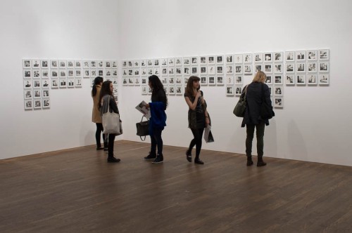
As you can see from the above picture, all the images in this show are the same in size, format and framing.  Some images are grouped together in double rows but other than that, all images have similar weight; even images with strong vertical elements that would apparently cry out to be framed vertically are doggedly landscape format.  Although the viewer sees the images one at a time, it is important to consider the exhibition as a whole (like a film) as it takes us on a journey from the outside of a grimy but active factory, with chimneys belching smoke or steam, around the corner to abandonment, then through a door to the decaying inside of the factory where time has virtually ground to a halt, and finally out to a more modern, active, but still industrial, world again where the clock is spinning even faster than before.  Humans are not shown but their presence is felt everywhere from the brickwork to the broken glass, from the wires to the wharves. The photographs were taken at different times and several locations so the story is made by the interweaving and sequencing of time and space.

David Lynch photographs

The pictures take us on a journey from the outside (on the left) through a door (centre) to the inside (right).

Although a few images use perspective to show depth and distance, most have a 2-dimensional, semi-abstract quality to them. Broken or asymmetric frames occur frequently as do strong lines, whether they are power lines, phone lines, windows, fences, barbed wire, poles or pipes. These all form strong graphical elements but they are often not quite horizontal or vertical, which encourages the viewer to tilt their head in a rather quizzical fashion in response to the tilt that Lynch has given the camera. Combine this with detail-less shadows and/or highlights, occasional camera shake or out-of-focus detail and the viewer may consider the images to be rather casual snapshots, but when put together in this show they give an impression that Lynch is quietly passionate about the subject; that he gets beneath its surface and sees that it had and still has value. He sees it warts an’ all but he doesn’t judge it, rather, he loves it.

A visit to the Photographers’ Gallery to see this and the other exhibitions is highly recommended. I’m sorry to say that TPG has now introduced a charge for entry. This is a shame and I’m sure they did this with reluctance, but it’s preferable to not having this excellent organisation. There are times when entry is free, and members get in free at any time, so do consider joining and supporting their work. 

J-H Lartigue at the Photographers’ Gallery

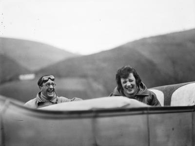
Jacques-Henri Lartigue (1894-1986) considered himself to be a painter not a photographer. Although from an early age he thought photography to be “a magic thing” and “nothing will ever be as much fun”, the photos he made were always personal. He moved in well-to-do French society circles and his photos amount to a personal documentation of this ‘set’ for much of the twentieth century, however the current exhibition at London’s Photographers’ Gallery (ends 5 January 2014) focuses on his relationship with his first wife Madelaine Messager, nicknamed Bibi.

Ubu and Bibi sur la route entre Lourdes et Pau.1925  © Ministère de la Culture-France/AAJHL

Ubu and Bibi sur la route entre Lourdes et Pau.1925 © Ministère de la Culture-France/AAJHL

JHL met Bibi in 1918. Initially he shied away from marriage, preferring his life of perpetual holiday and flirtation supported by the family’s fortune. He gradually fell more deeply in love and they married in 1919. The photographs from the period 1918-1923 are generally happy, sun-lit scenes with Bibi featuring centre-stage, though there is a very portentous image taken in London:

Bibi in London.  © Ministère de la Culture-France/AAJHL. One book dates this image as 1919 however it is dated as 1926 at the Photographers' Gallery

Bibi in London. © Ministère de la Culture-France/AAJHL. The Aperture History of Photography book dates this image as 1919 however it is dated as 1926 at the Photographers’ Gallery

They had a son, Dany, in 1921 and a daughter in 1924 but tragically she died after only a few months. This event seems to have been the start of a widening chasm between JHL and Bibi: his diary does not give the impression of a problem with the marriage but he does fall in love with another woman with whom he has an affair. Bibi relies on her father for emotional support rather than her husband. The images show Bibi being increasingly marginalised in JHL’s life: she may be a small detail in a larger image, relegated to the background or even out of focus:

Bibi in Marseilles, 1928  © Ministère de la Culture-France/AAJHL

Bibi in Marseilles, 1928 © Ministère de la Culture-France/AAJHL

Although there are many clues to their deteriorating relationship in the photographs, JHL’s diaries suggest that he is unaware of the problem. It is only in 1930 and following the death of Bibi’s father, that she leaves him and he writes “My broken heart only wishes her well”.

Photographically speaking Lartigue functioned at an intuitive level, reacting without conscious thought to every circumstance and scene before him. His was a natural, unforced talent that was only recognised late in his life. He didn’t have much time for analysis, saying “To talk about photos rather than making them seems idiotic to me.” So it’s just as well he isn’t able to read this blog then!

This exhibition is sensitively curated and thoughtfully displayed: well done to the Photographers’ Gallery for fitting it in to their schedule!

Photo gallery walk, central London

Here’s a walk I take when I want to see lots of quality photography in central London. I don’t rush and I take street photos on the way – allow a couple of hours at least.

A British summer in Oxford Street

A British summer in Oxford Street

I’ve made a Google Map if that helps:

I start by getting off the tube at Piccadilly Circus and visiting the Chris Beetles gallery,

Chris Beetles Gallery, Swallow Street

Chris Beetles Gallery, Swallow Street

then head up Regent Street or one of the many interesting back streets, to the Photographers’ Gallery.  By the time I’ve had a good look, including a dangerous browse in the bookshop, it’s time for some lunch in their excellent cafe…

The Photographers' Gallery from the Oxford Street approach

The Photographers’ Gallery from the Oxford Street approach

…then over the road to the Getty Images Gallery.

Getty Images, Eastcastle Street

Getty Images, Eastcastle Street

Sometimes this is all I have time for, but the walk can be extended to  the Margaret Street Gallery and the Atlas Gallery.

If you like ‘straight’ architectural photography, it’s worth detouring via the Royal Institute of British Architects where there are high-quality images on display. They are also planning to open a gallery space in 2014, which could well be interesting, photographically speaking.

Deutsche Börse Photography Prize 2013

The Photographers’ Gallery, London, is currently displaying the four finalists for this year’s Deutsche Börse prize.  There’s a range of techniques in use – two of the entries re-purpose photographs rather than originating their own – but all have strong messages to examine and interpret.  They are all good in their own way but is there a winner?  Well, for me there is, but let’s look at the entries before deciding.

Fifth floor display

The fifth floor: Broomberg & Chanarin’s entry in the floor stands, and De Middel’s entry on the walls. All images copyright Malcolm Raggett

Mishka Henner

“No Man’s Land” shows remote European locations and the sex workers who ply their trade there.

part of Mishka Henner's exhibition

Still images appropriated from Google Street View for Mishka Henner’s exhibition

Henner used information gleaned from the Internet to pinpoint the locations, then Google Street View to obtain the images for the exhibition.  His work contained still images, a video that was really an animated slide show, and recordings of bird songs from the locations.  This last component was the only evidence that the artist had visited the locations – assuming that he made the recordings – since the images had all been taken by the Google Street View project.  I was expecting this work to make me feel at least slightly voyeuristic but oddly it didn’t.  Perhaps this was because of the banality of the images, or maybe because I already knew that a robot had taken them rather than a human.

Although I found myself worryingly unmoved by the subject of his exhibition, I think Henner’s methodology is more significant than the actual images displayed.  The idea of re-purposing information from innocuous  to nefarious uses is hardly new, though it doesn’t do any harm to highlight and question the ethics of this especially in this digital, connected age.  Just because you can, doesn’t mean you should.

Adam Broomberg & Oliver Chanarin

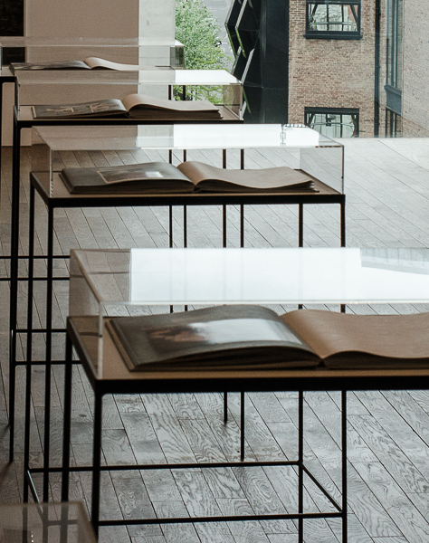
This pair of artists produced a hand-made book based on the 1955 publication “War Primer” by Berthold Brecht.  This new book is called “War Primer 2”  and has recent images overlaying the original ones, so each page is now a diptych with the original photograph partially obscured but still able to impart its chilling message.  The overlay image is taken from the internet or news clipping and is from more recent conflict.  There is also a four-line poem on the page.  The exhibition shows multiple copies of the book open at different pages.  Enough aspects recent wars are shown for the whole effect to be tellingly anti-war but, given the time difference between the original and new books, also asking why do we still make war?  Have we learned nothing from these conflicts except how to create ever-more effective ways of killing people?

display cases

display cases showing War Primer 2 by Broomberg and Chanarin

Chris Killip

Killip documented the impact of industrial change in the north of England in the 1970s and 1980s.  This period spans the decline of socialism and the rise of capitalism, as a labour government gave way to Thatcherism: when social need took a back seat to personal greed.  The title of the exhibition is “What Happened – Great Britain 1970-90”.  This is not a question (“what happened?”) but a statement (“this is what happened”).  Although it would be more accurate to limit the title to the north of England rather than the whole of Great Britain, these images are part of a larger retrospective, which may well deserve the broader title.  I found it impossible to put the images in chronological order from the image content alone, the message I take from this is that very little changed in the two decades – people were still living in a degraded environment in relative poverty and with a fair degree of hopelessness.  So much for politics and politicians!

Killip exhibition

part of the Chris Killip exhibition “What Happened – Great Britain 1970-90”

Christina De Middel

In the 1960s a Zambian teacher had the amusingly crackpot idea of using a catapult to put a team of Zambians (and a cat) on the Moon and Mars ahead of the Russians and Americans. All he needed was the money (yeah, know the feeling!)

Christina De Middel's fictional account of the Zambian Space Programme

Christina De Middel’s fictional account of the Zambian Space Programme

Reviving the idea, De Middel has created a fictional account of the Zambian Space Programme in her book “The Afronauts”.  This project has a charming wackiness to it that really appeals to me: fiction meets fashion meets documentary meets archive.  Its more serious message is to question our sometimes gullible, unquestioning attitude to the way stories are distilled and presented to us.

Who wins?

Each of the finalists is good in their own way.  I’m not a great fan of image appropriation but War Primer 2 uses others’ images very effectively, in fact it is hard to see how the book could have been accomplished otherwise.  No Man’s Land, though, is a lazy man’s approach to photography: the whole project could have been achieved from an office and a computer, its only saving grace is the questions it raises by virtue of the methodology, including image appropriation, used.

De Middel’s project is fun but also has a serious side, so “well done”, but I just find the message a bit naive to be a real winner.  Then there is Killip’s documentary, which shows commitment and competence over a long period but could be criticised for having a traditional approach – well of course it does, Killip’s career has spanned 4 or 5 decades and easily predates digital manipulation and multiple media.  But its still gets its message across loud and clear, and it is still relevant today.

So my winner is: Chris Killip
worthy runner-up: Adam Broomberg and Oliver Chanarin
third would be: Christina de Middel
and a hearty pat on the back for Mishka Henner.

The official winner will be announced on Monday 10 June.